FormulaFolios Digital Account Opening
UX design & research: Erica Lin
Visual design: Erica Lin
Tools: Figma
Overview & Background
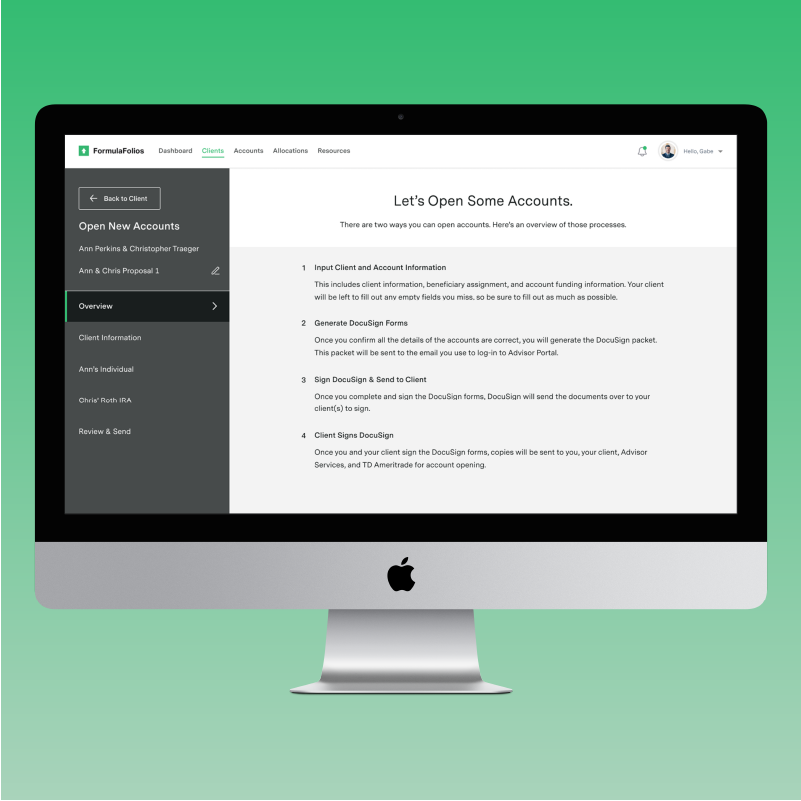
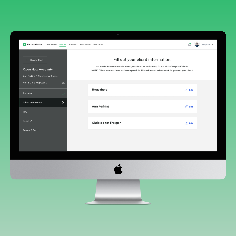
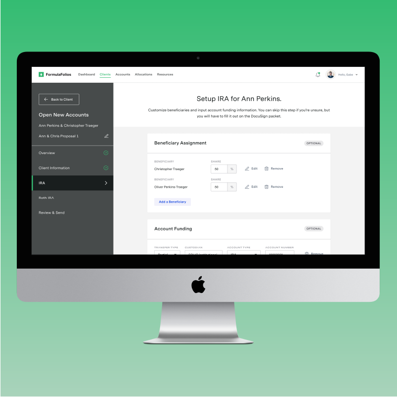
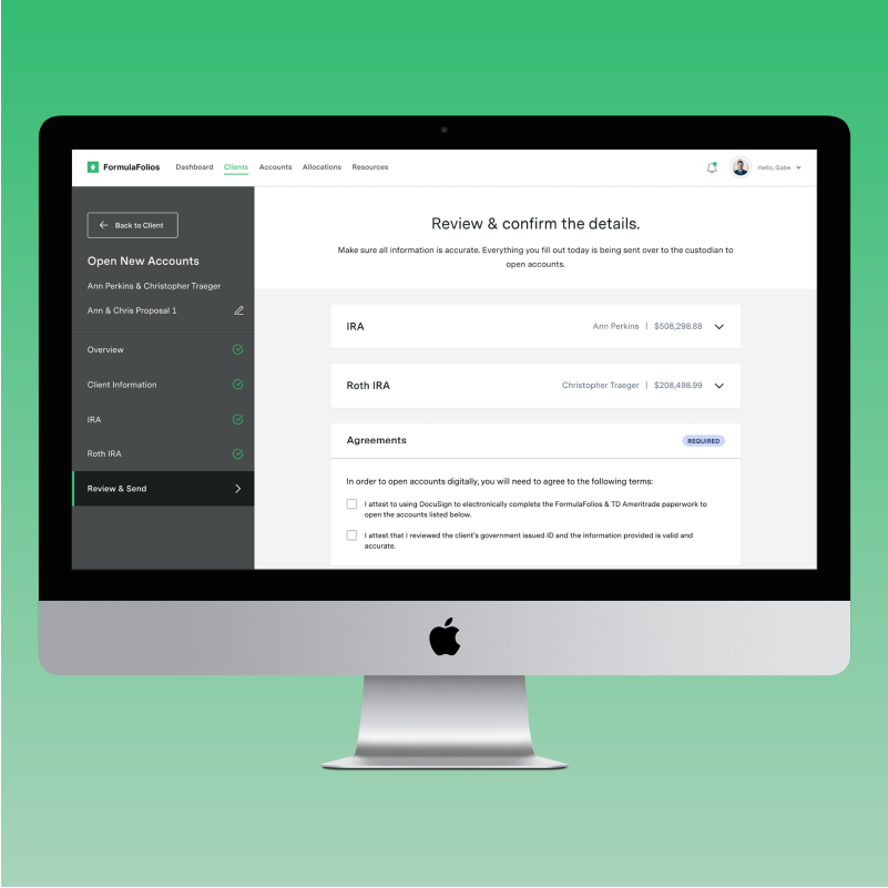
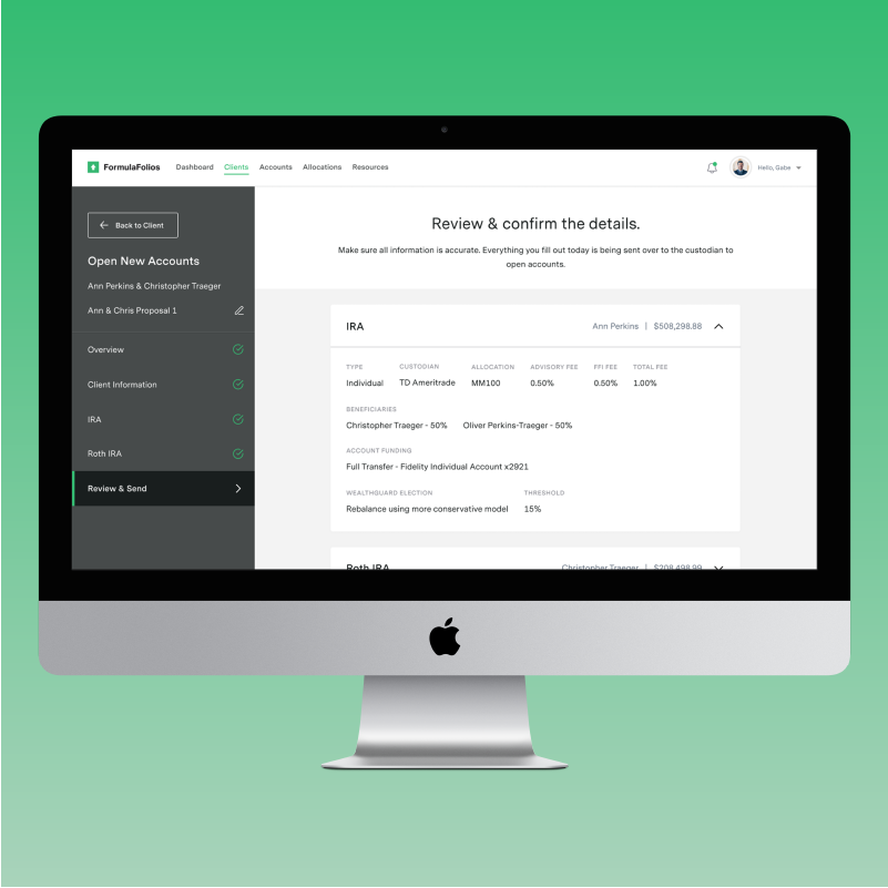
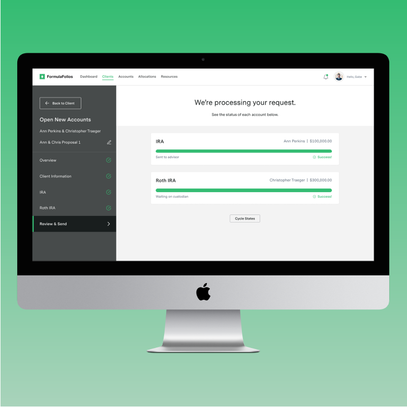
FormulaFolios Investments (FFI) is an investment firm that services independent advisors and advisory firms. FFI offers a digital platform for its advisors. This digital platform includes the “Advisor Portal” (AP), which is the primary web application for financial advisors. The primary purpose for AP is to provide advisors with essential documentation, and make profiles for their clients. However, the newest feature of AP now allows advisors to open accounts for their clients completely digitally (the current process requires manual paperwork and wet signatures).
The Problem
Digital account opening is the newest feature implemented for AP. However, the process of opening these accounts digitally was not entirely clear. Through a bit of discovery and research, there were a few issues identified:
No clear instructions
A lot of guessing to figure out what the required steps are
No scalable way to add customizations or extra steps to the process
The Solution
Design an account opening experience that has clear steps and instructions, setting expectations for the user
Make this experience scalable for new requirements and steps that may need to be added
Account for different user flows and scenarios, as there are a few paths advisors can take to open their clients’ accounts digitally
Deliverables
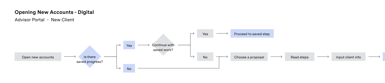
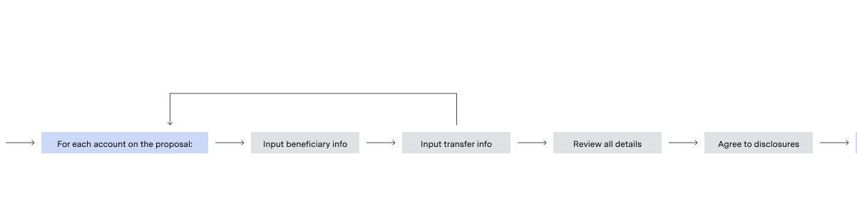
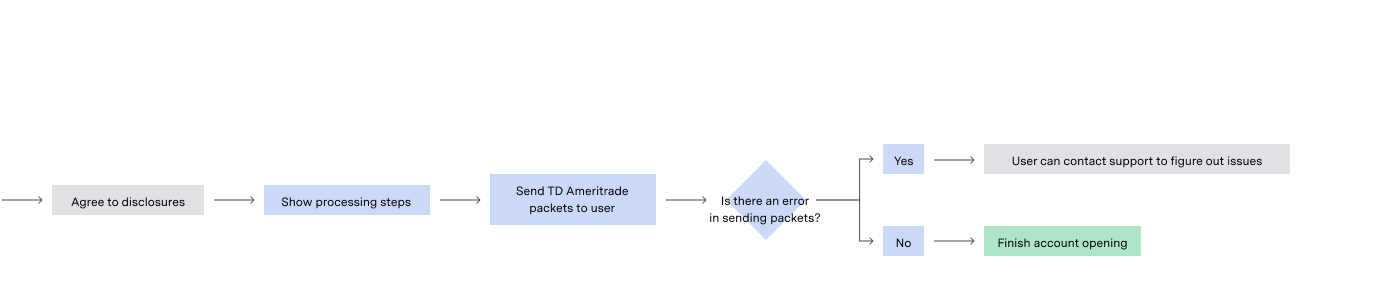
System map - A diagram mapping out the user’s steps, accounting for as many scenarios as possible
Prototype - A comprehensive clickable design that conveys to developers how the working product should function
Process
Testing/Review of the existing user experience. This part of the process helped us identify the usability issues, which was outlined in the “problems” section above. See the script. See the key takeaways.
System map diagramming was crucial to ensure we did not miss any steps in the process. This was determined by the Product Managers and business stakeholders. See the system map.
Wireframing a few different types of “process” interfaces to ensure we had a few ideas to discuss. My typical process includes presenting a few different ideas to my Product Manger, and deciding together which idea fits best.
Prototyping the complete user interaction. These prototypes leveraged the components in our design system, making it easy to create high fidelity prototypes. I had to run this by the Product Manager to ensure it was hitting all the right requirements. See the prototype.
Usability testing was conducted to ensure this experience was usable and met user expectations. The main things I was testing was the interaction with the “Next” steps, the side navigation, and way finding. See the testing script. See the testing results..
Implementation of the final product. Once we tested our prototype and validated it was usable and met all business requirements, we added it into the development sprint. I worked closely with the developers to ensure that all the functionality and UI was implemented correctly.