
Verizon Unified Ordering
UX design & research: Erica Liu
Visual design: Paola Rangel
Tools: Sketch, InVision, Lucid Chart, Usertesting.com, Zeplin
Our Problem
Verizon has two primary lines of business: wireless and wireline (internet/TV/home phone). Traditionally, the two businesses were operated independently of each other, which also meant Verizon customers received two separate customer experiences. Verizon recently had an internal reorganization in which the operations were combined. As a result, the wireline and wireless digital ordering experiences also have to be combined. In addition to the complex differences in the backend systems and development framework, the two businesses also have distinctly different design systems and brand guidelines. These issues all needed to be resolved in order to create a unified ordering experience.
Our Solution
Design an ordering flow that is seamless, intuitive, and transparent for the customer
Provide prospective customers with enough guidance to order the correct services for their needs, without unnecessarily pushing other services on them
Allow customers to leave and resume orders seamlessly without losing progress or forgetting what they’ve already configured
Account for all different user flows and scenarios, including new customers and existing customers (for either service)
Ensure the designs are consistent with other parts of the experience, including learn (marketing) and account experiences
Deliverables
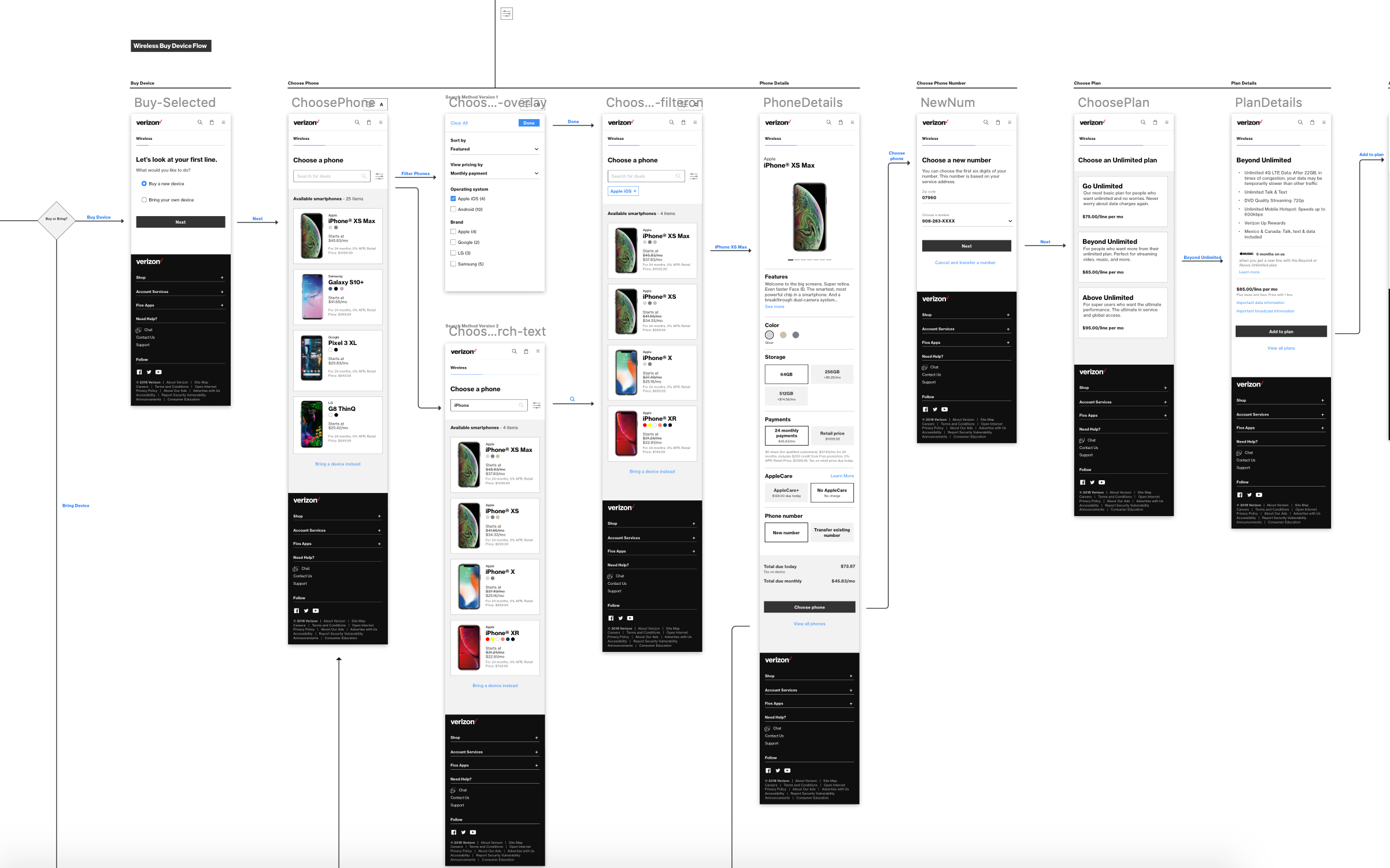
System map - An objective diagram mapping out the user’s steps, accounting for as many scenarios as possible
2 core prototypes - 1 for a completely new customer to Verizon, and 1 for an existing Verizon Wireless customer
Wireflow - An organized map of wireframes that brings the system map to life in order to help developers
Process
See the process deck for a comprehensive view of what went into this project.
Audit/review of existing user experiences and journeys.
Competitive analysis was conducted to scope out any industry trends. We noticed there weren’t a lot of similar experiences out there, being that ordering two seemingly different types of services in one experience is not very common. It’s not entirely an e-commerce experience because of the nature of how customers need to order these services, so that made it a bit challenging to find similar examples aside from direct competitors.
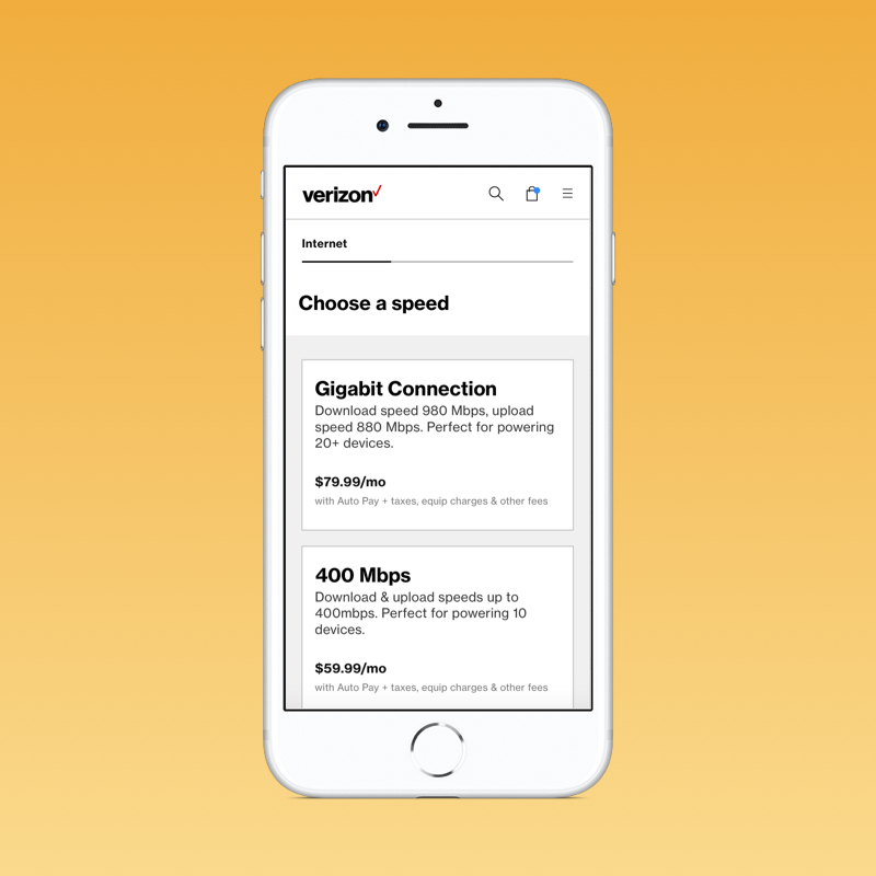
Research was conducted in order to understand how users purchase smartphones and internet. We learned a lot from these insights, primarily that (1) users are really deterred by price when it comes to mobile phone purchases and (2) users may not be familiar with internet speeds and which speed is right for them. See the research documents.
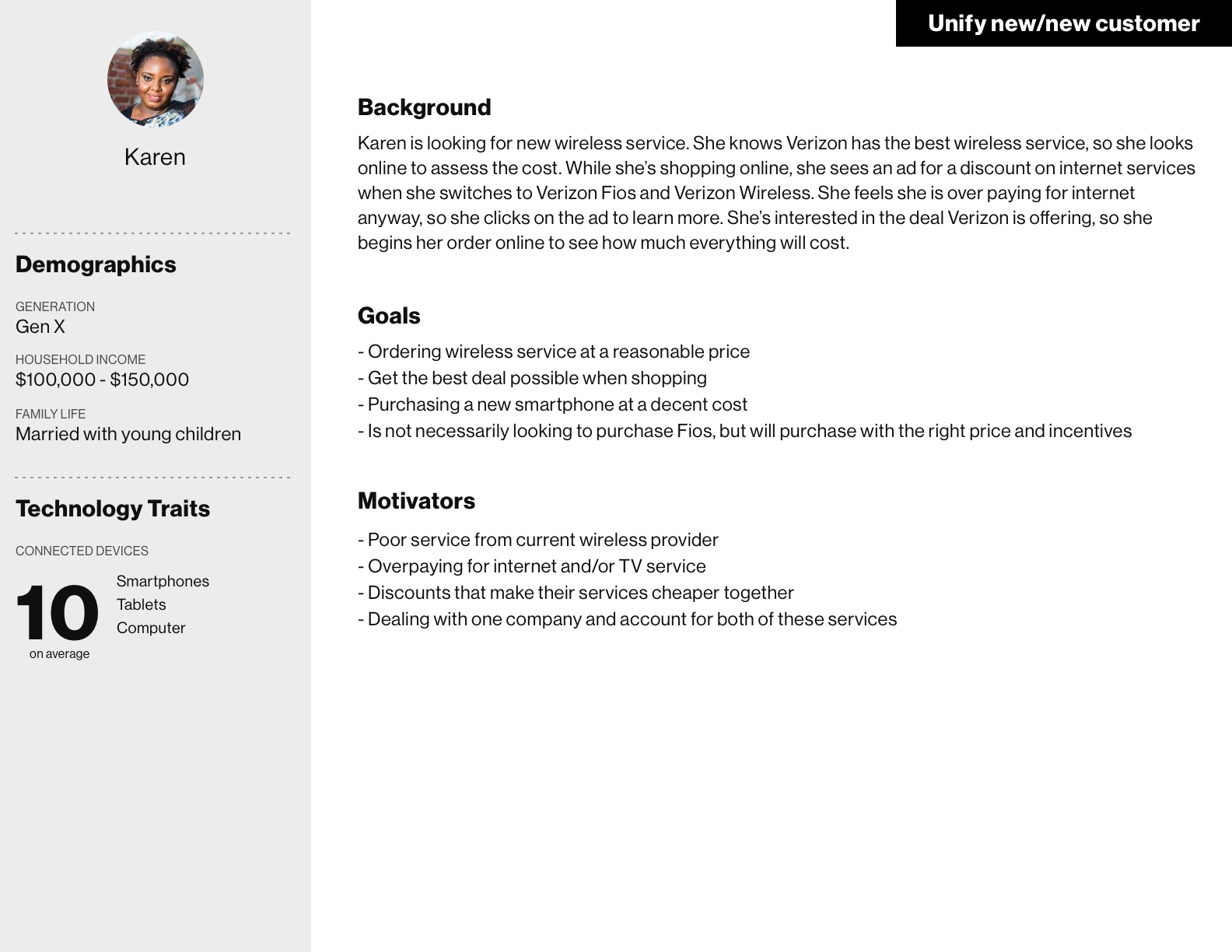
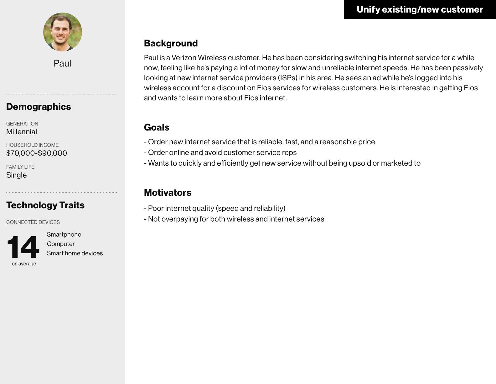
Personas were created, although they were not based on intense research. We took what we knew about the customer from our sales experience, and created proto-personas in order to help guide us as we designed. See the proto-personas.
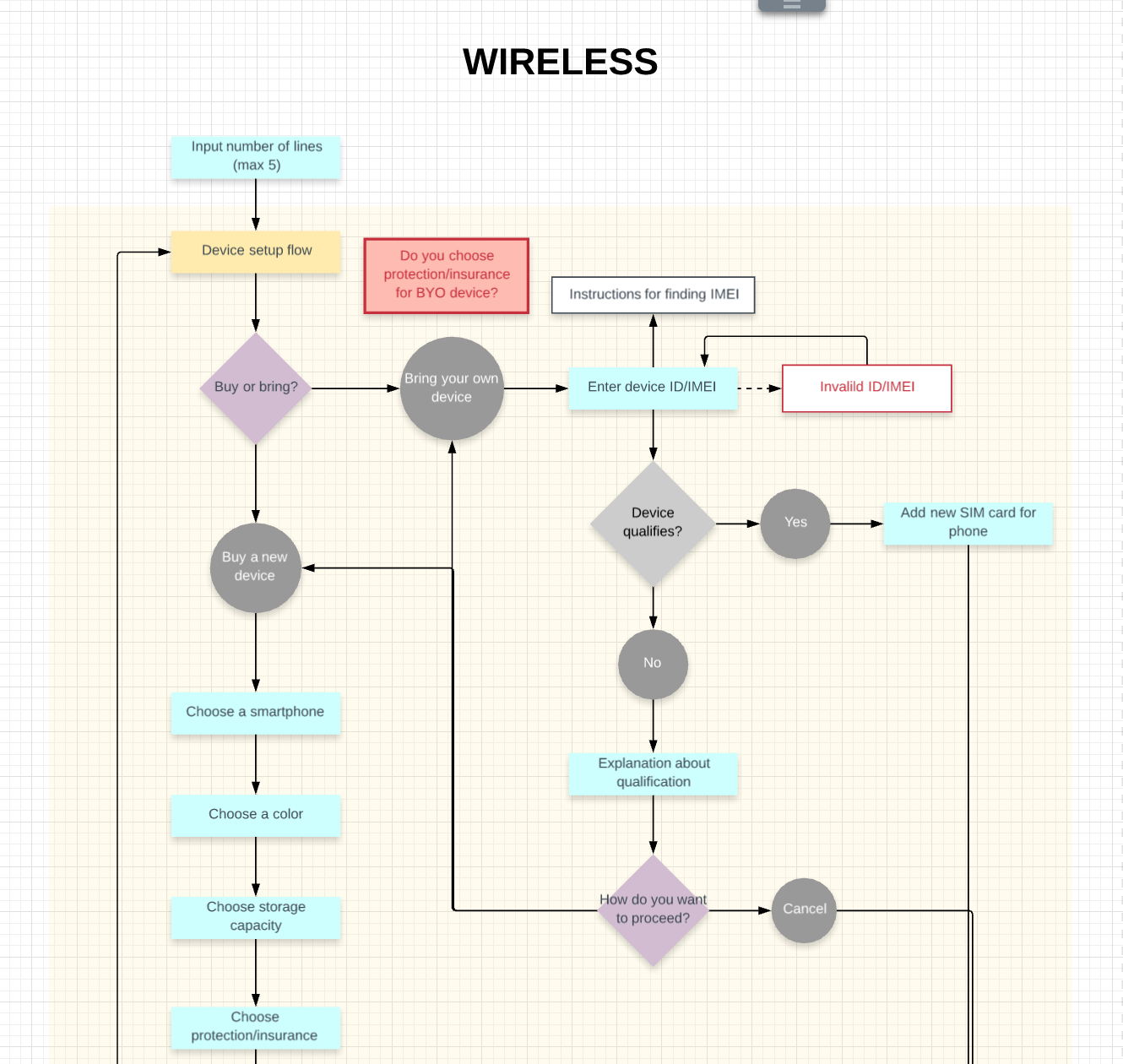
System map diagramming was a critical part of our process. We met with the business and used the results of our audit in order to create a comprehensive system map of all the different decision points, system points, and paths a user could go down. We also leveraged some user research conducted on smartphone purchasing in order to help determine the user journey. This living, breathing document is constantly being updated based on changing business requirements. See the system map.
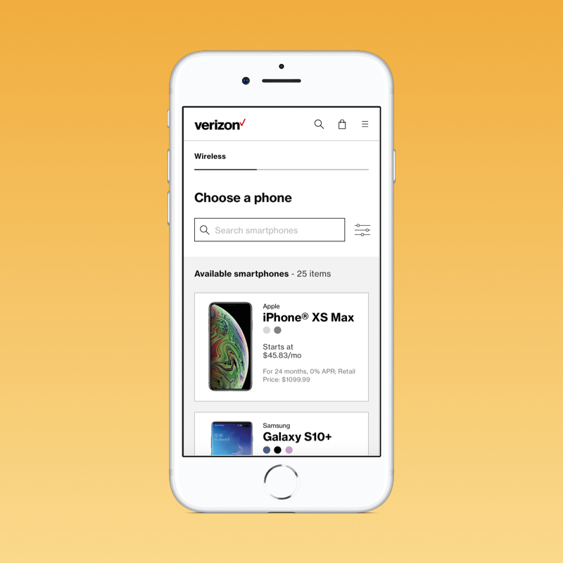
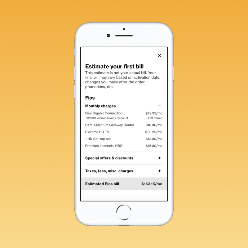
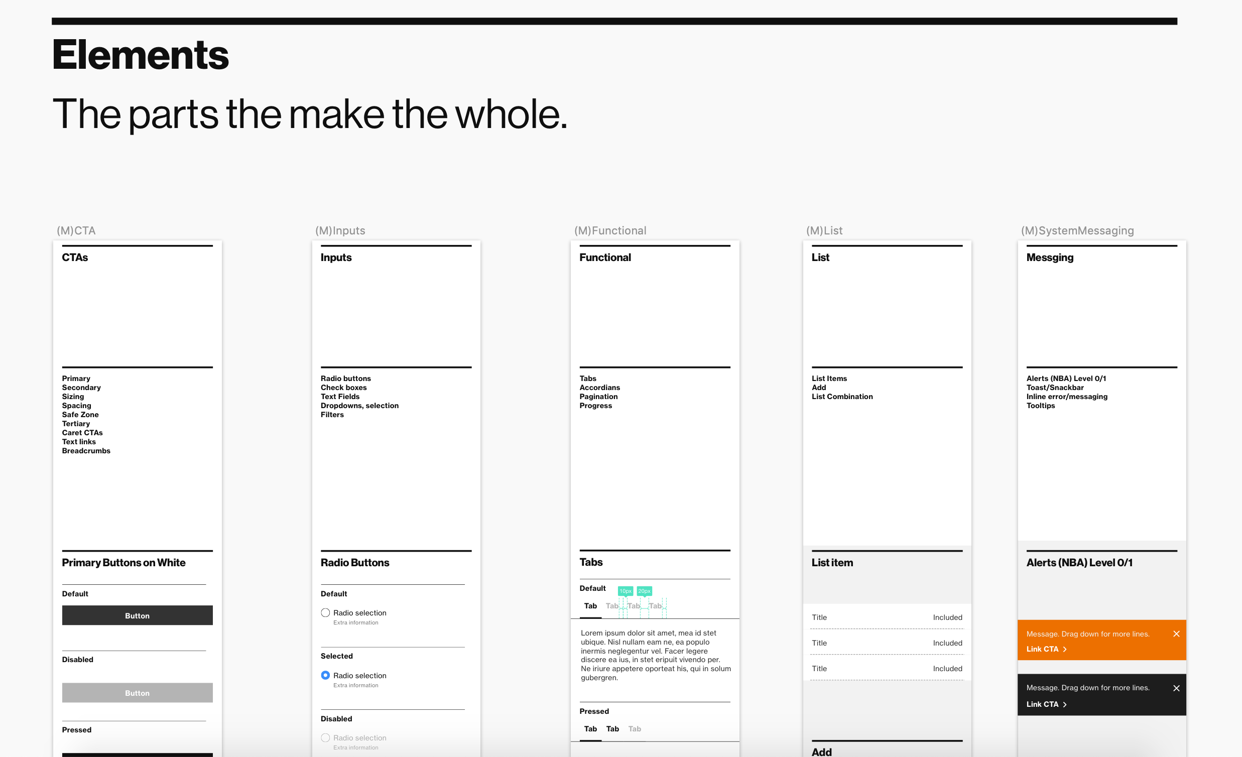
Wireframing & prototyping low fidelity prototypes of the MVP/core experience to be developed and tested first. This experience was aimed at existing Verizon Wireless customers who want to purchase Fios, and this flow also gave them an opportunity to change their data plan. For our wireframes, we leveraged our design system, which made it extremely efficient to design our ordering pages. If we created any components that could be re-used in other experiences, we also added it to the design system.
Usability testing was conducted, primarily to determine if the experience aligned to users’ expectations. We were also trying to research what motivators would drive users to engage in this experience, and what detractors would cause them to disengage. There were also several different parts of the experience we wanted to test to see if the process was intuitive to the user or not. See the testing script.
Visual design came last, taking the low fidelity wireframes and creating high fidelity comps. Brand guidelines were leveraged here, as well as the design system.
As this is still in design, development has not occurred and is expected to occur in 2019 Q4.
Challenges
The biggest challenge for this experience was trying to design an experienced when the business rules were still a bit disjointed. We also had to determine how to sell two seemingly different services (wireless and internet) in a single experience, without feeling pushy to the customer. Additionally, a lot of mobile and internet terms are similar (like GB storage verse gigabit internet connection as the biggest confusing example), so there was an element of guidance and clear way-finding that needed to be incorporated into this experience.
Determining the MVP was also tricky, as there is a lot of influence from the business partners around what the MVP should be, even if it meant a complex experience for the customer/user. We ultimately had to work together to determine the simplest MVP we could test to see how this new experience would perform against the existing experiences.