Verizon Unified Account
UX design: Erica Lin, Paola Rangel, & Sean Joseph
UX research: Erica Lin
Visual design: Paola Rangel
Tools: Sketch, InVision, InVision Studio, Qualtrics, Usertesting.com, Optimal Workshop
Our Problem
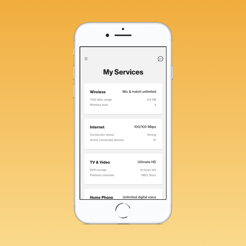
Verizon has two primary lines of business: wireless and wireline (internet/TV/home phone). Traditionally, the two businesses were operated independently of each other, which also meant Verizon customers received two separate customer experiences. Verizon recently had an internal reorganization in which the operations were combined. As a result, the wireline and wireless businesses would like to see the account experiences be combined. This was a natural progression from the combined ordering experience, as when users order both services together, they would expect to see one single account to manage all their service details and billing.
Our Solution
Design an experience that allows existing Verizon customers to manage both Fios and Wireless from a single app
Make it easy for customers to find exactly what they need, prioritizing the top features
Guide customers to explore other areas of the app to find features that would be beneficial to them, and that may also prevent calls to the help desk
Limit the amount of advertisements and deals users are exposed to in order to emphasize the value of the app and not dilute it as another sales avenue
Process
See the process deck for a comprehensive view of what went into this project.
Research was conducted in order to understand who our users are. We started with a survey, in which we asked some general questions around account behavior. We then got volunteers to engage in interviews, during which we dug deeper into how Fios customers use their account and what features are most important to them. See the raw data & analysis of the survey and interviews.
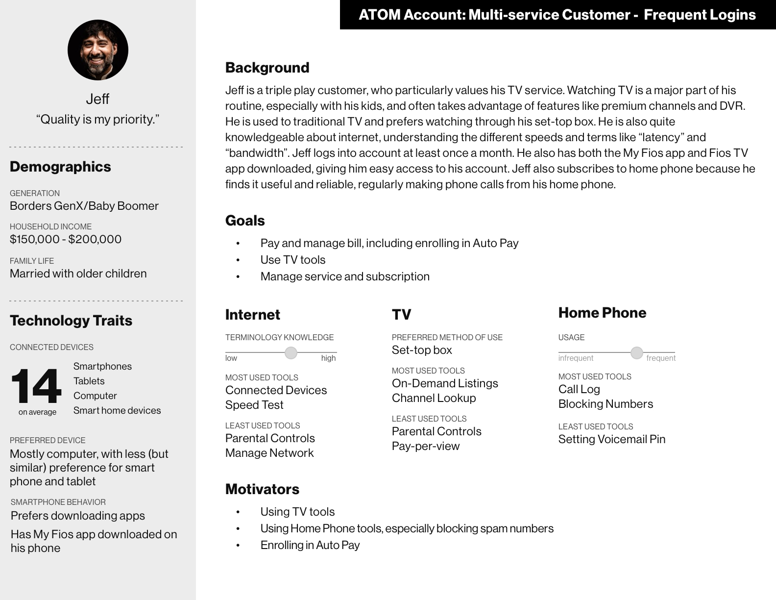
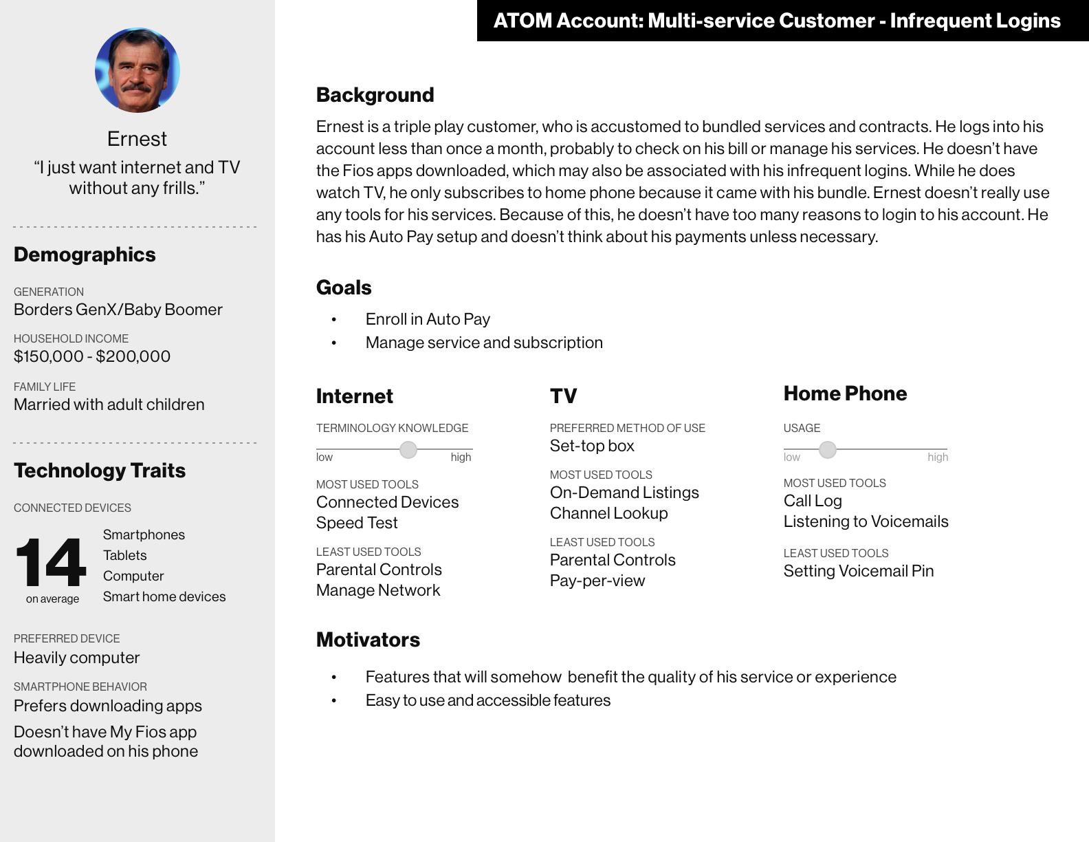
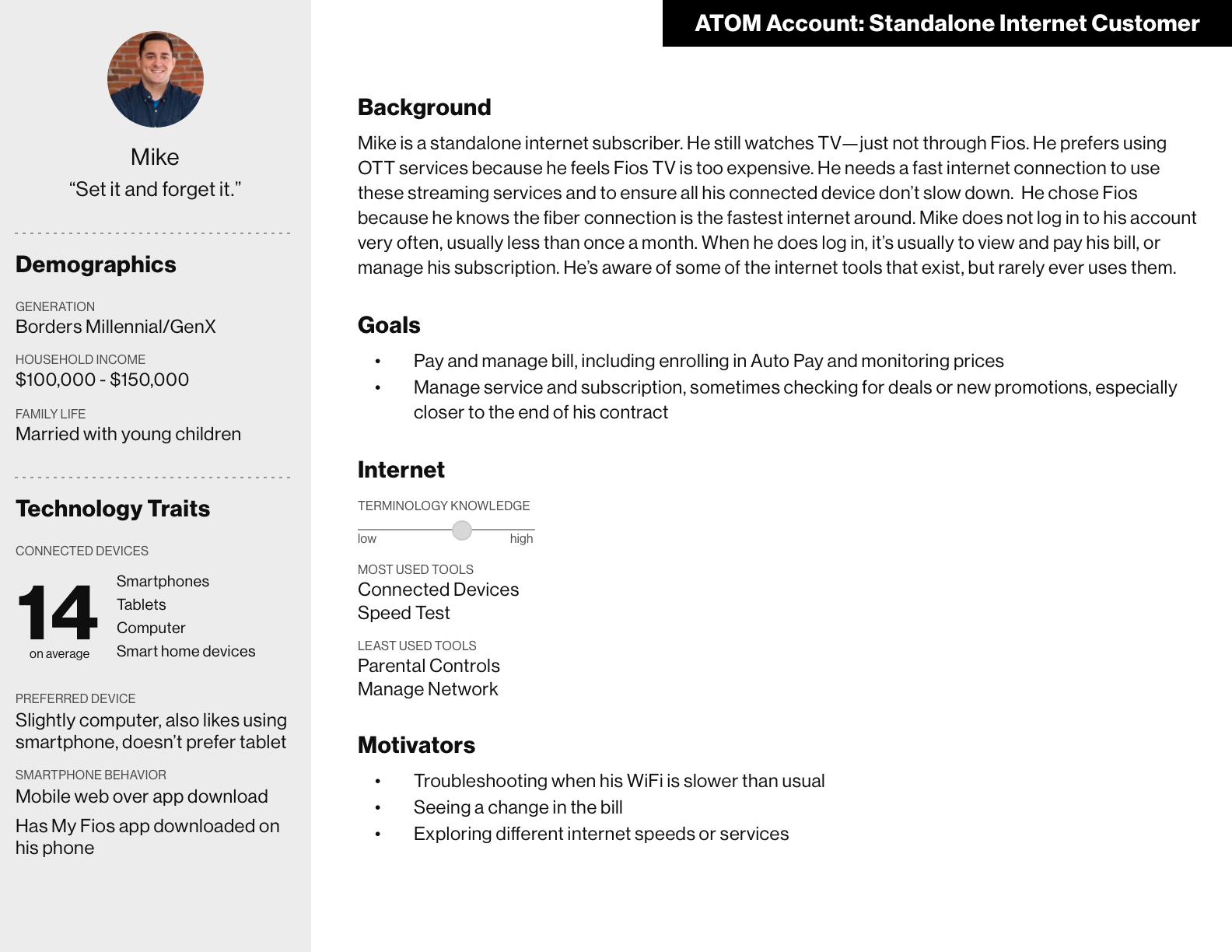
Personas were created, based on this research. We found there were 3 primary personas: multi-service frequent logins, standalone frequent logins, and standalone infrequent logins. These personas were the foundations of our designs as we decided which things to prioritize and de-prioritize. The personas can be found on the gallery to the right.
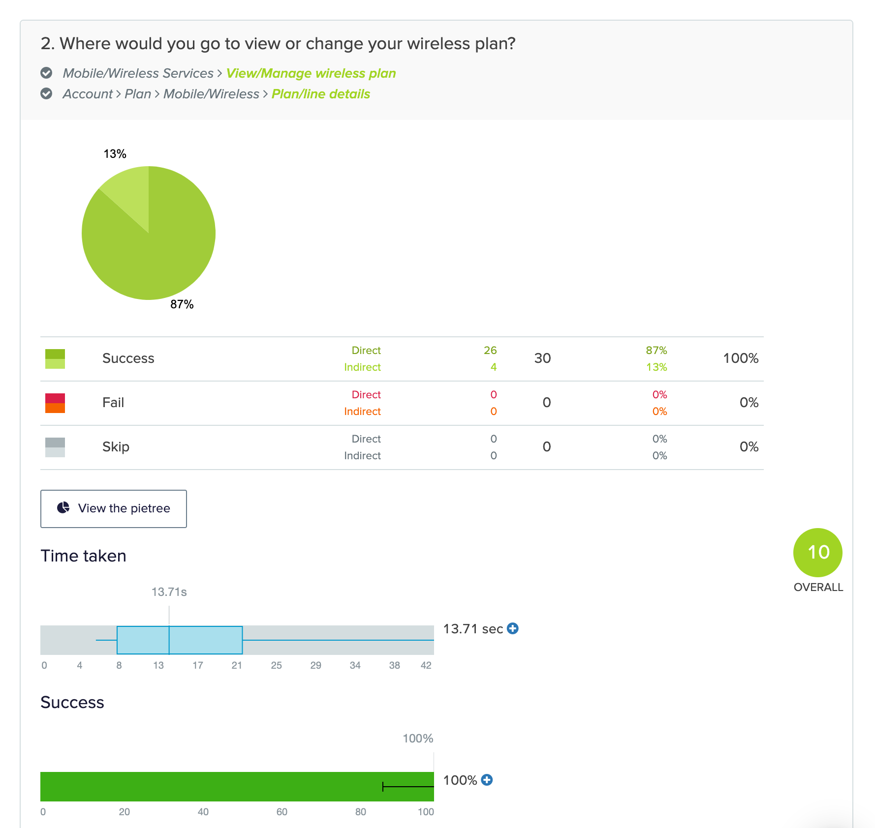
Tree testing was conducted in order to validate our app information architecture. We gave our customers an IA and asked them the most common tasks customers do on the app. We had very high success rates, with every task succeeding above 90%. See the tree test results.
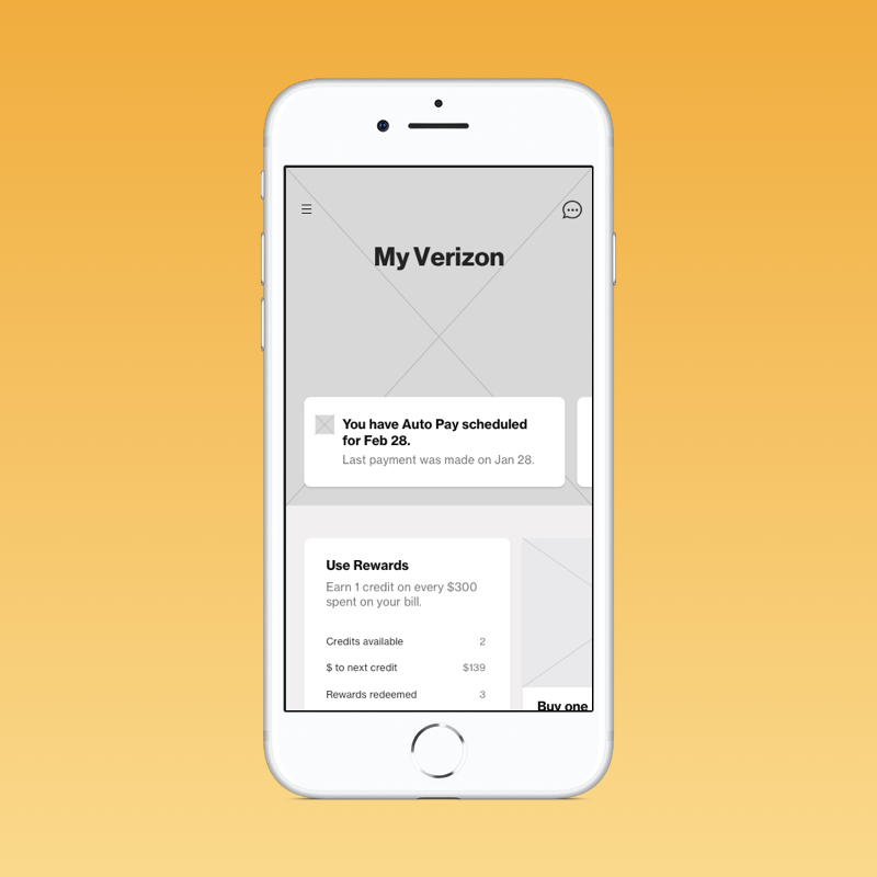
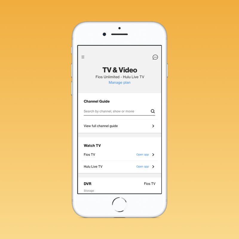
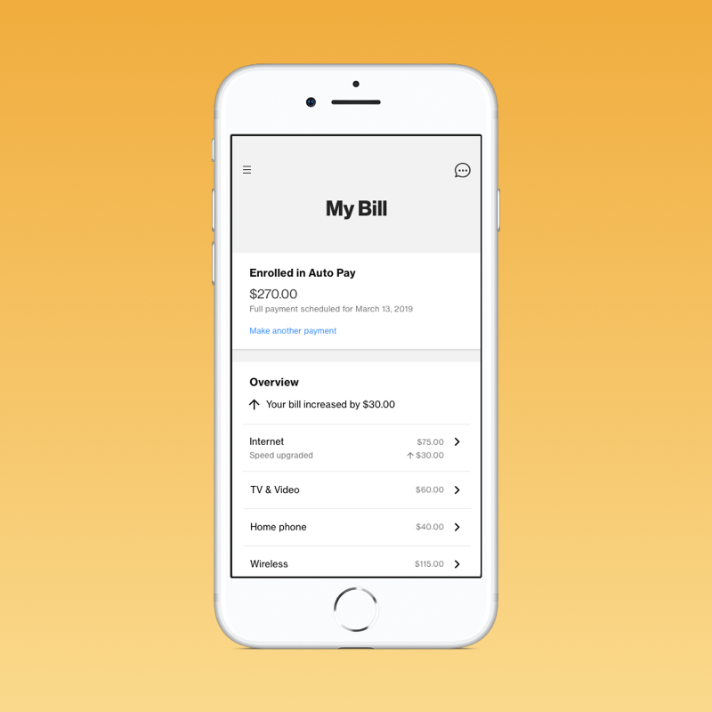
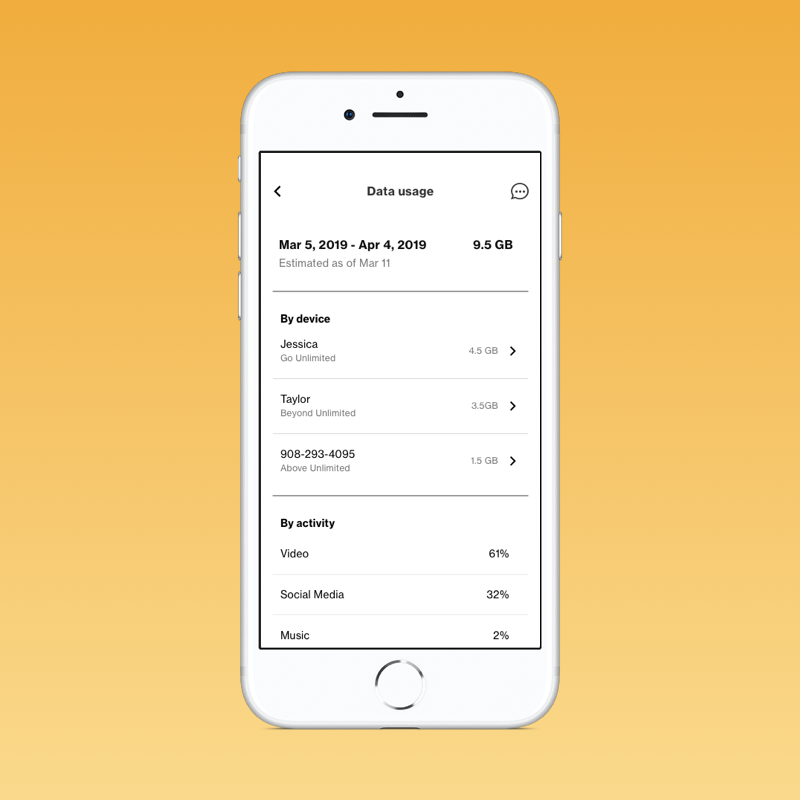
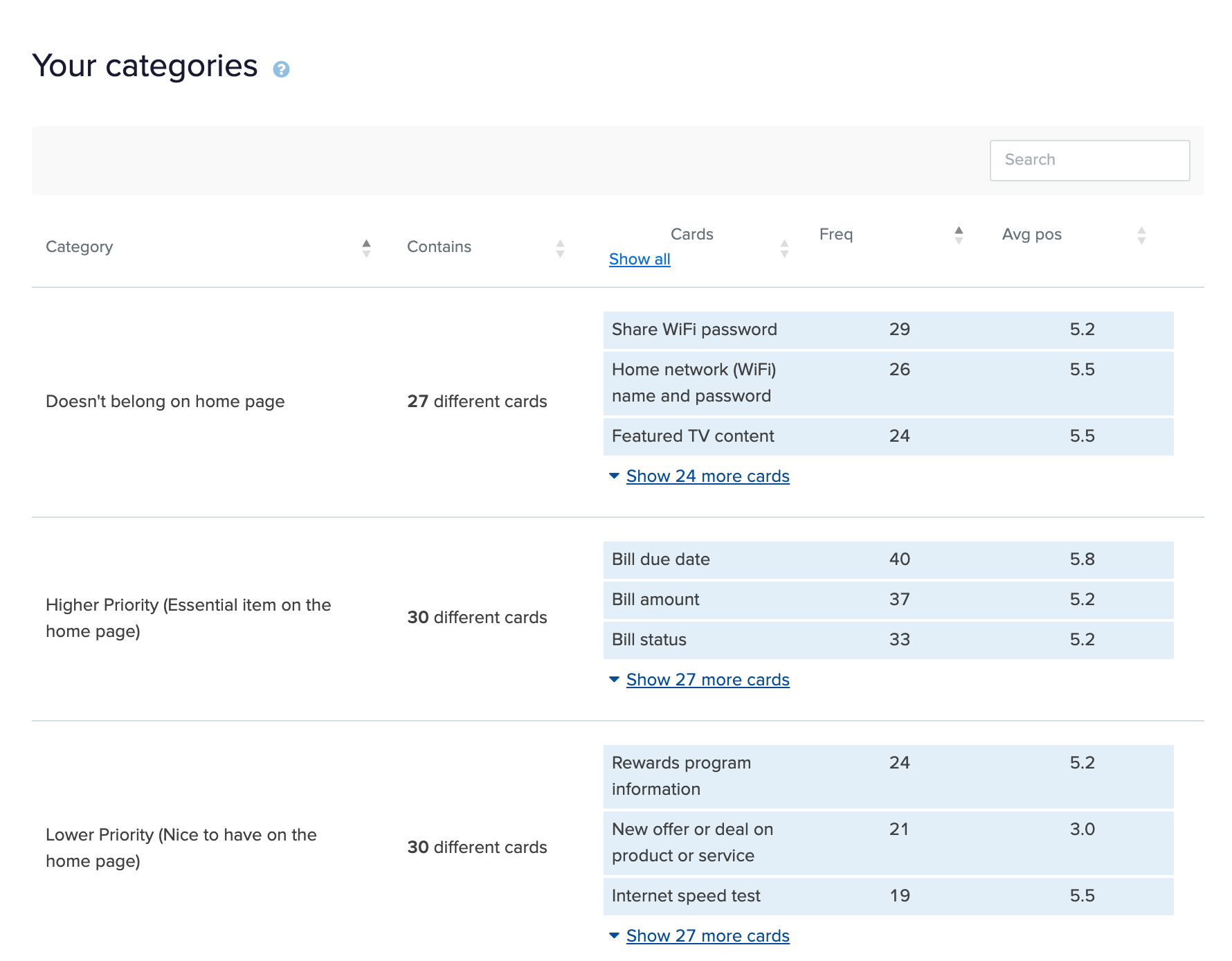
Home page research was conducted in order to determine what users prioritize in their home page feed. We did this study via Optimal Workshop. We gave users a bunch of cards with potential home page features, and asked them to sort the cards via “high priority”, “low priority”, or “doesn’t belong on home page”. These results showed strong patterns, with users clearly wanting to prioritize billing details. In fact, a lot of the things we initially included in our designs on the home page were things users placed in the “doesn’t belong” category. This helped improve our design greatly. See the full study details and analysis and the raw data.
Wireframing & prototyping low fidelity prototypes of the MVP/core experience to be developed and tested first. We had 3 different prototypes, exploring 3 different concepts and designed by 3 different designers. We then used the prototype that performed the best in our usability testing, which happened to be my prototype. We then focused on that singular design and continued to build out the rest of the experience. See the prototype.
Usability testing was conducted, primarily to determine if the app experience was aligned with our users’ expectations, and if they would have trouble performing the most common tasks we found users perform in our initial research. The prototypes tested very well, and users really liked the construct we had created. See the usability study summary and script and raw data (prototype 3 was my prototype).
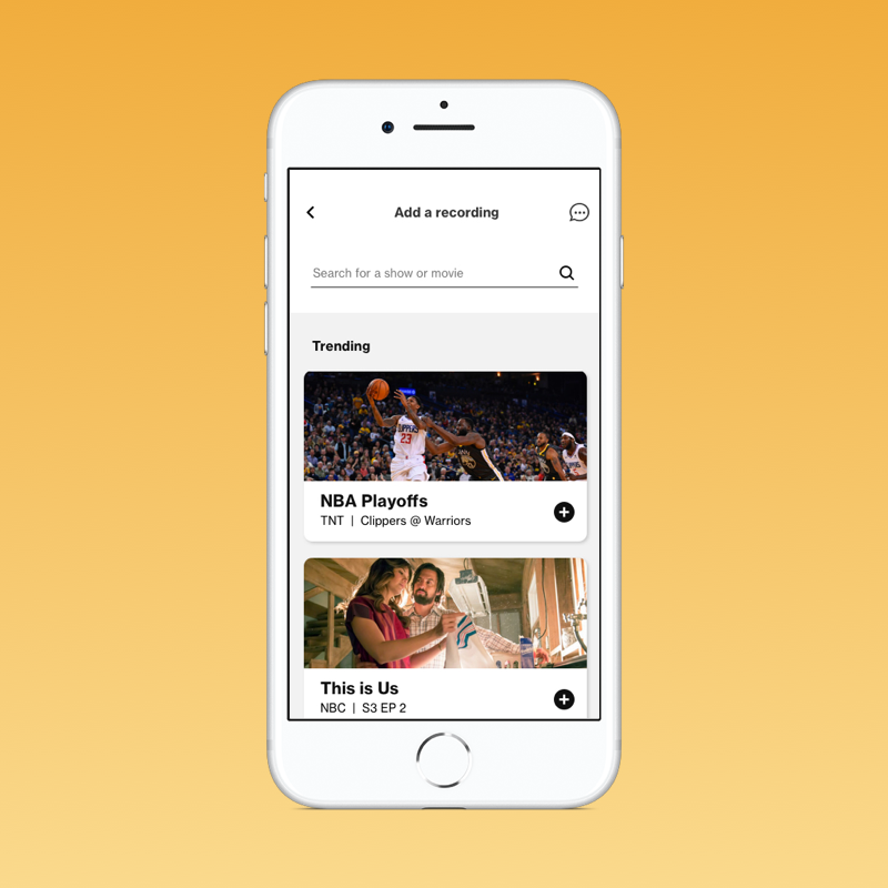
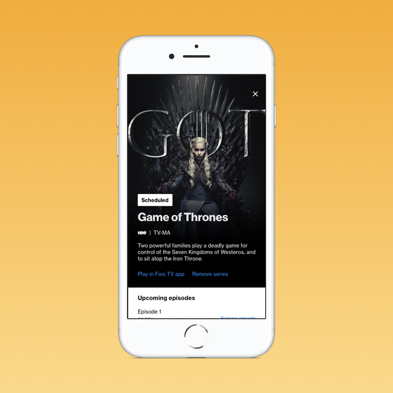
Animations and interactions were prototyped in order to provide development with more detail. See how I prototyped the DVR interaction.
Visual design came last, taking the low fidelity wireframes and creating high fidelity comps. Brand guidelines were leveraged here, as well as the design system.
As this is still in design, development has not occurred and is expected to occur in 2019 Q4.